MERCHI (메르치)
©2026
SCOPE
Branding
Visual Identity
Art Direction
PROJECT TYPE
Self-Initiated
INDUSTRY
Restaurant / Hospitality
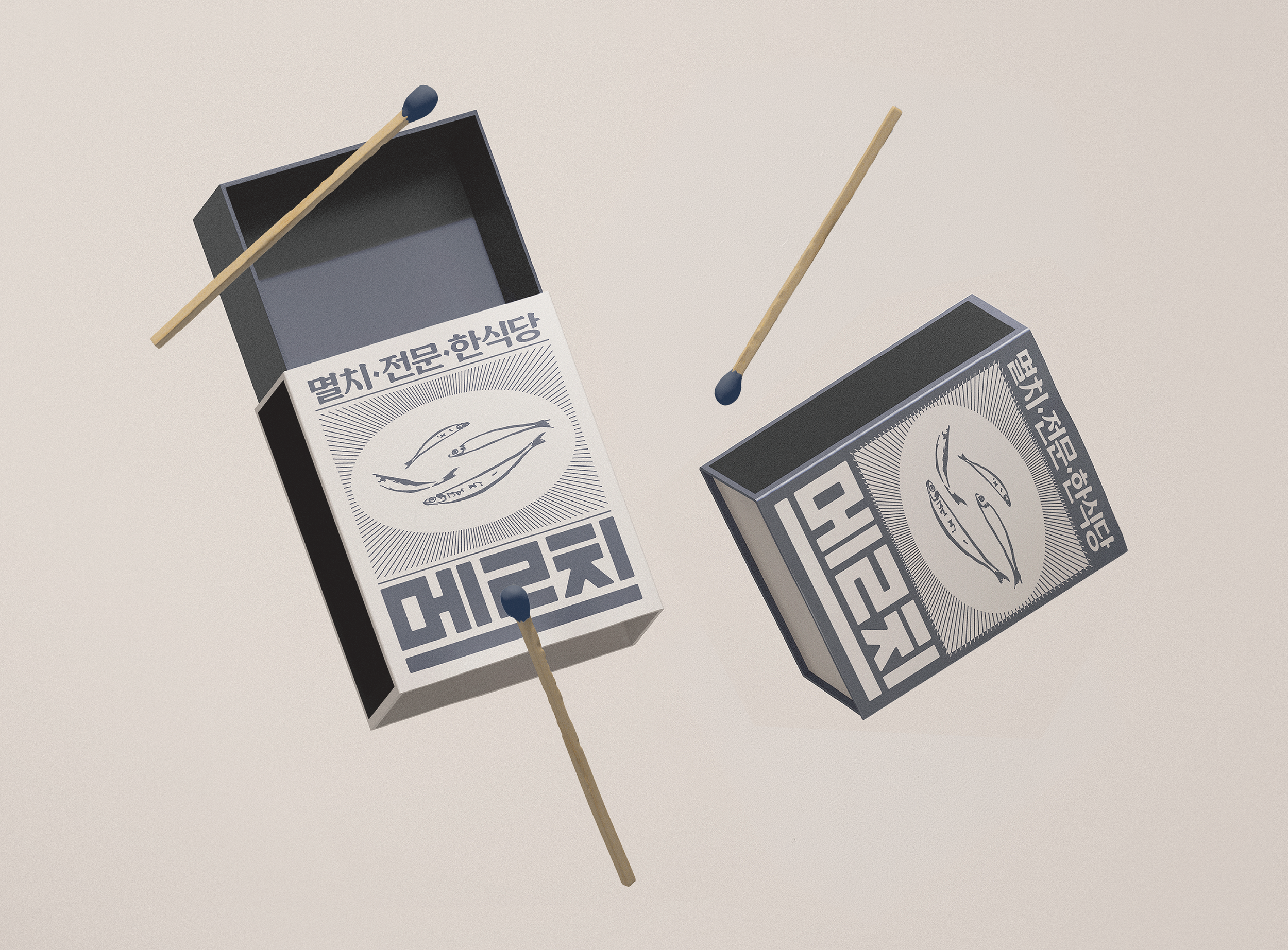
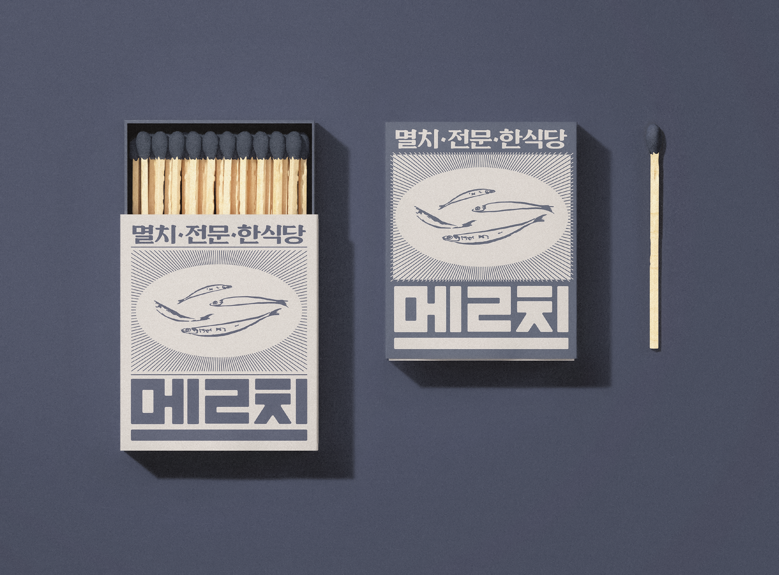
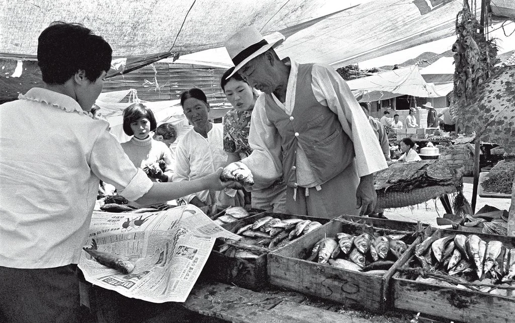
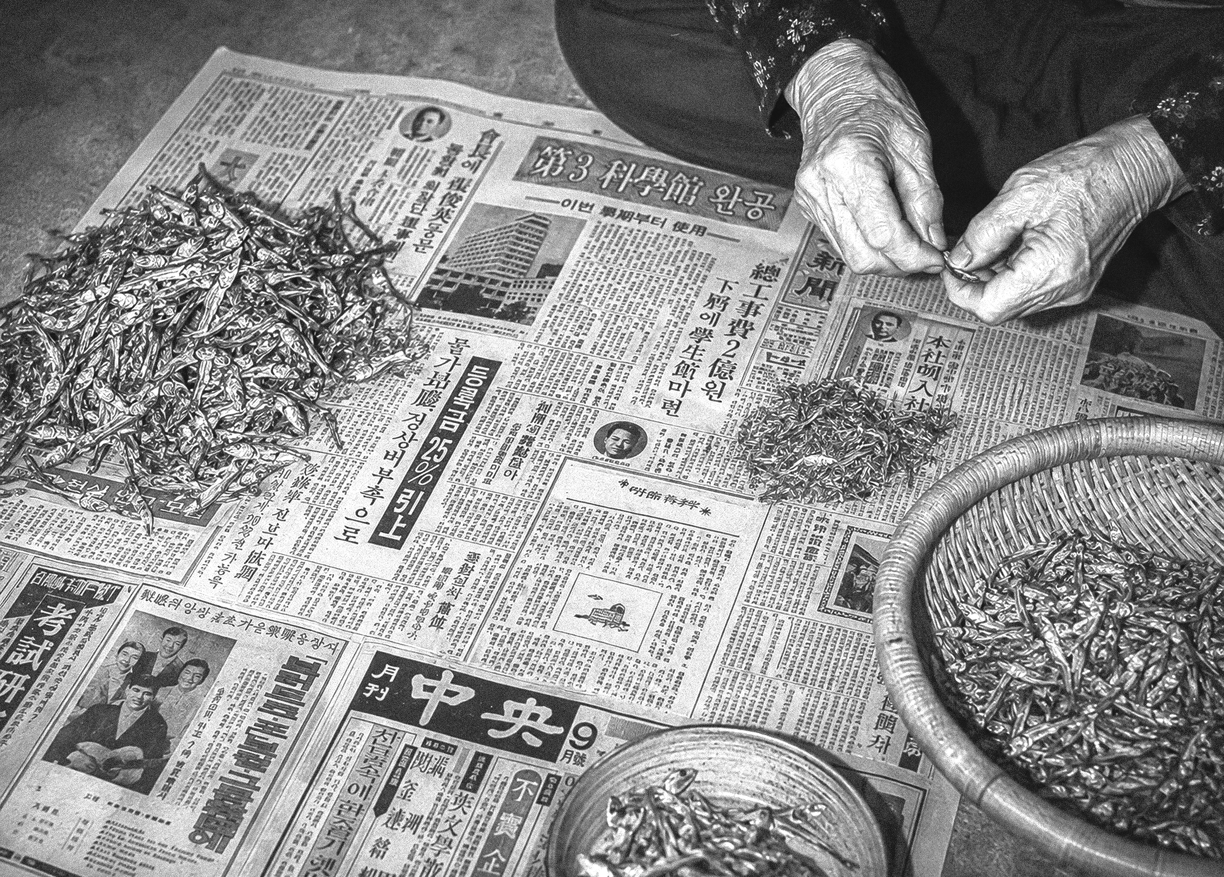
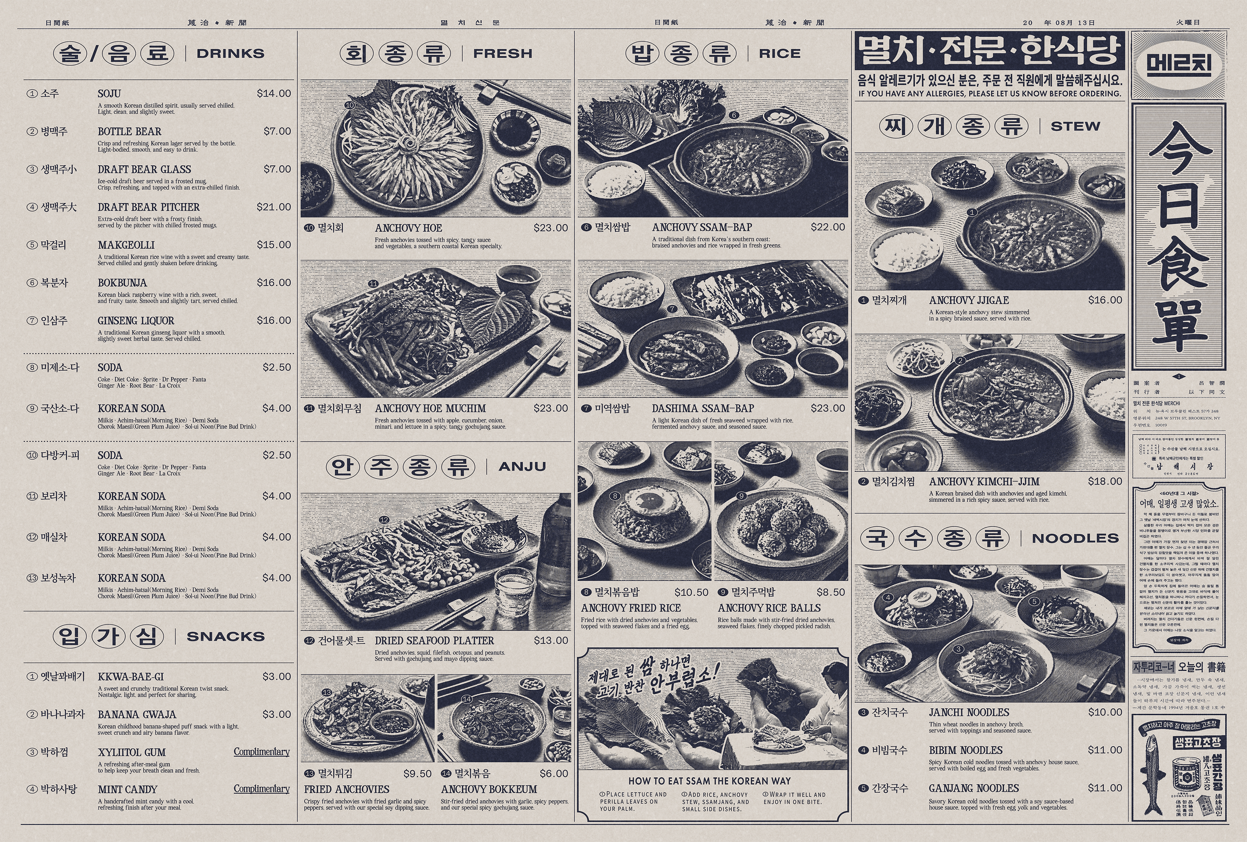
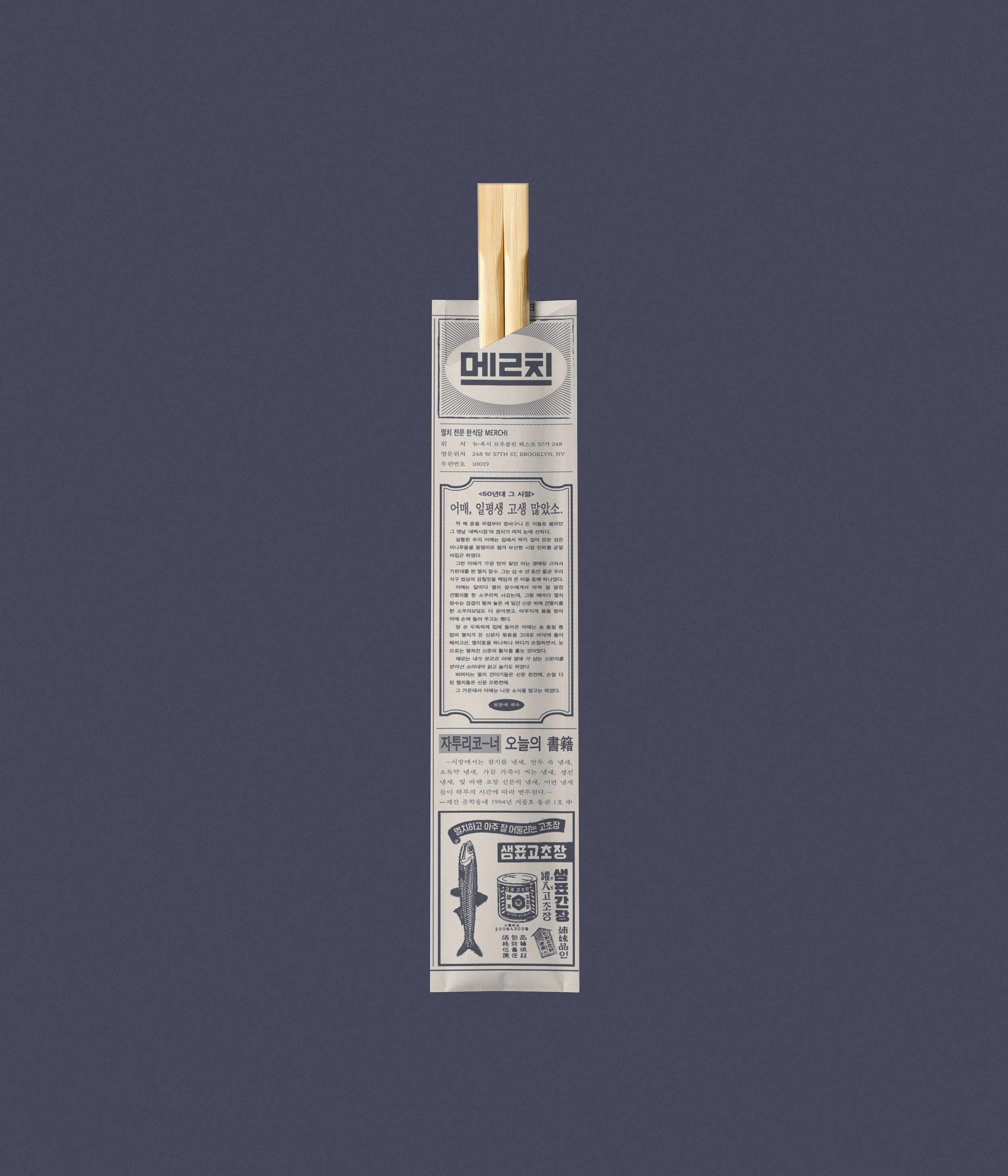
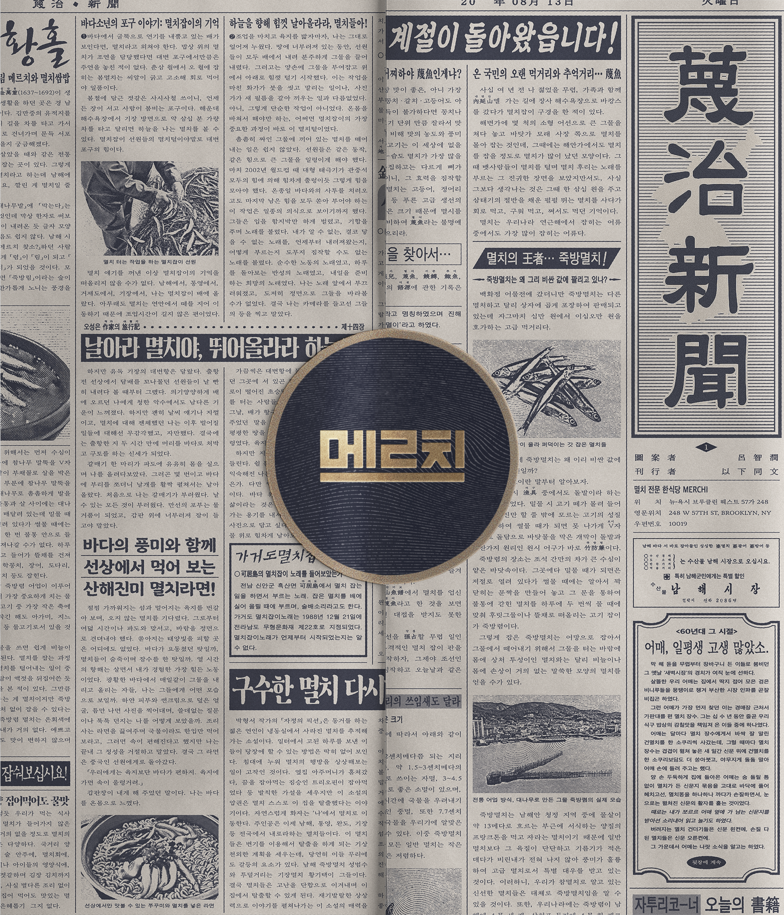
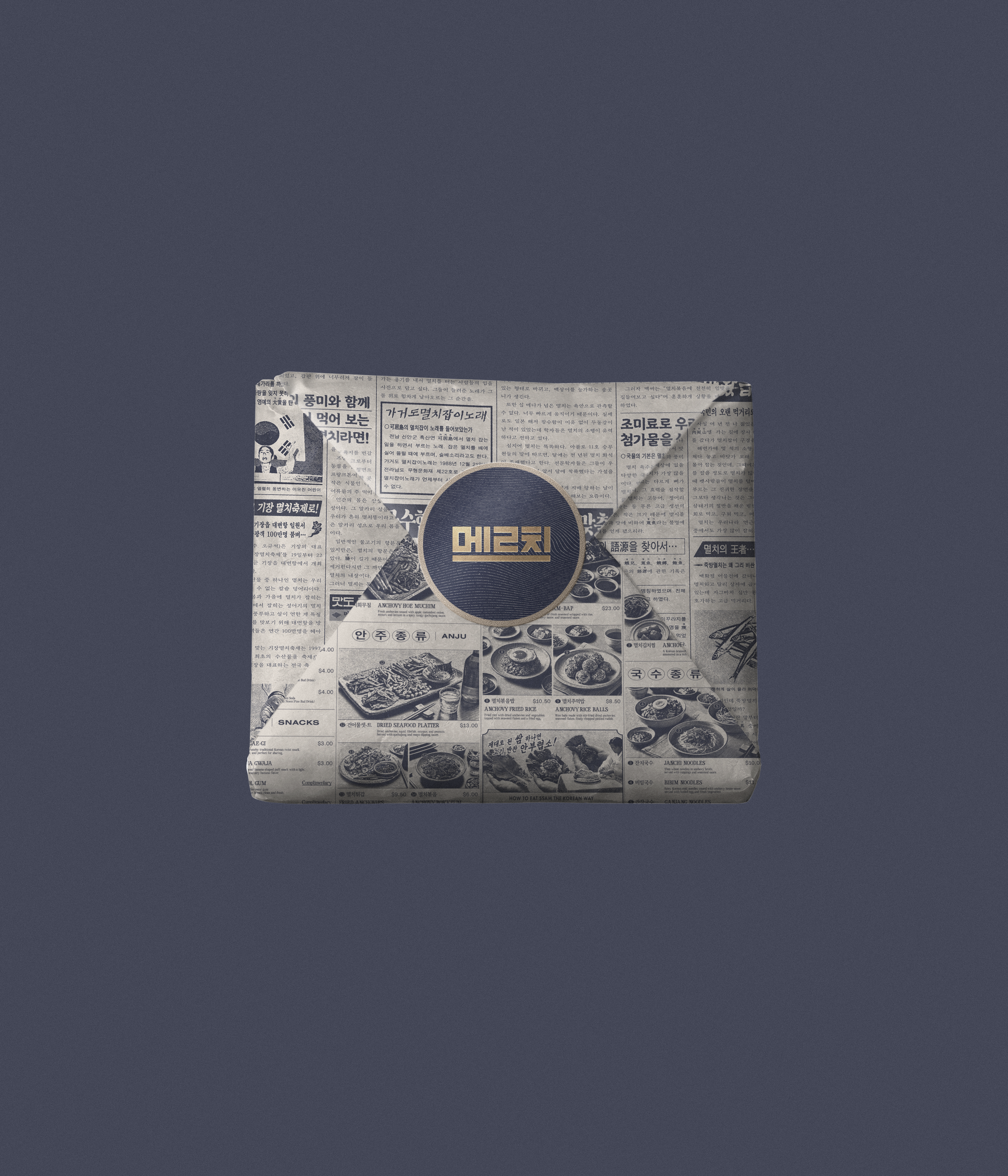
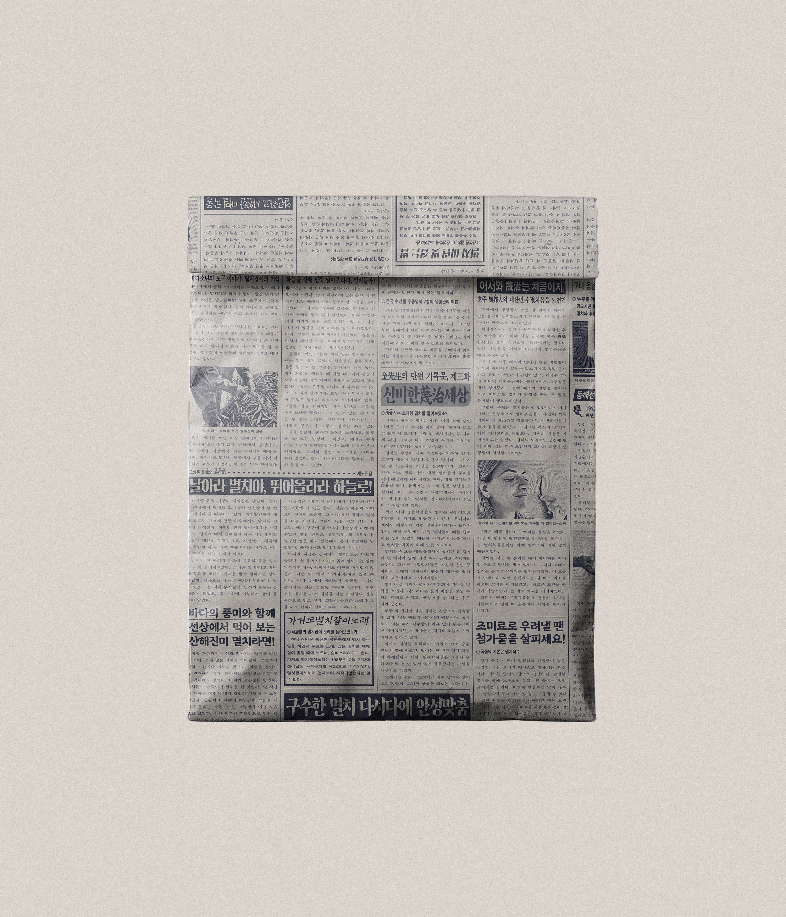
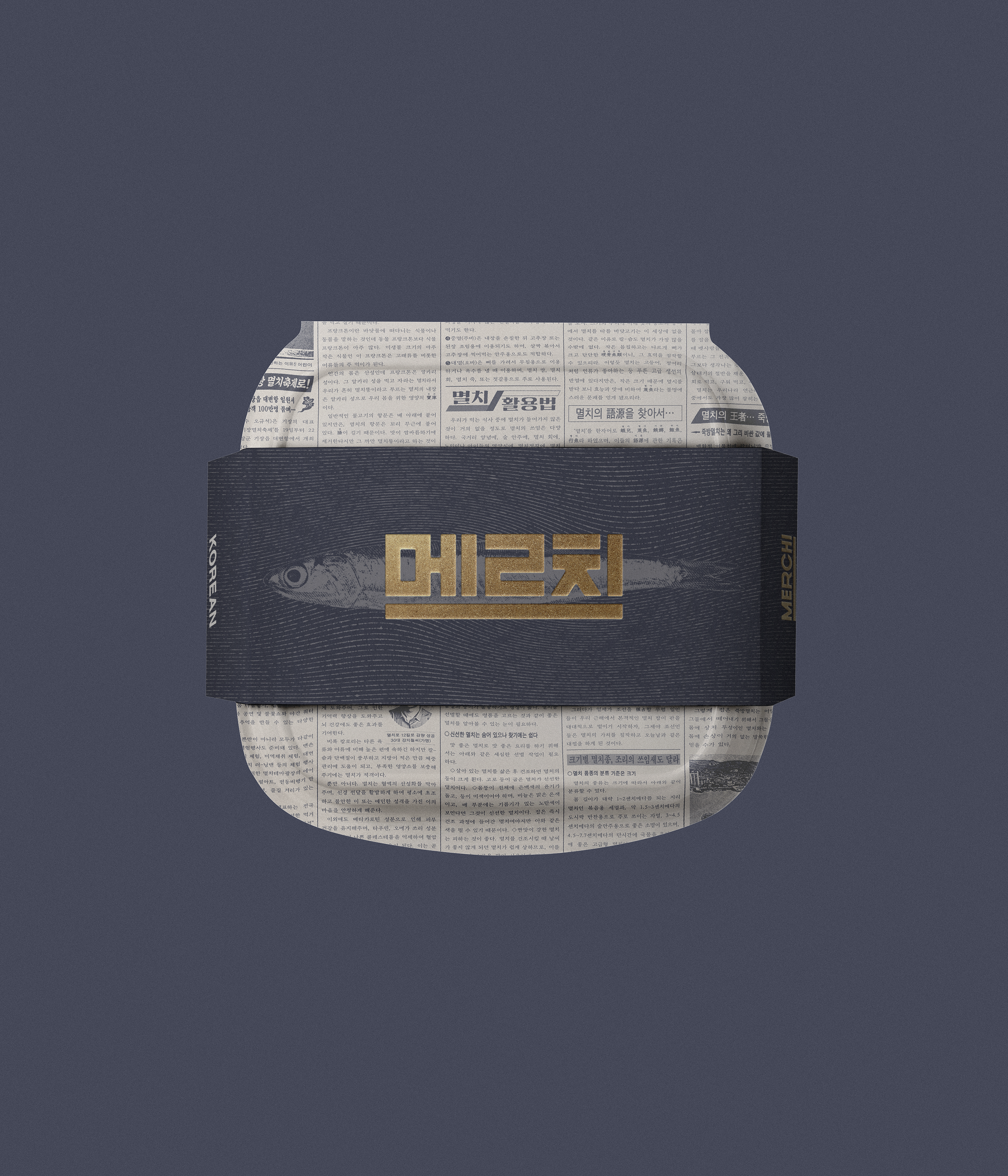
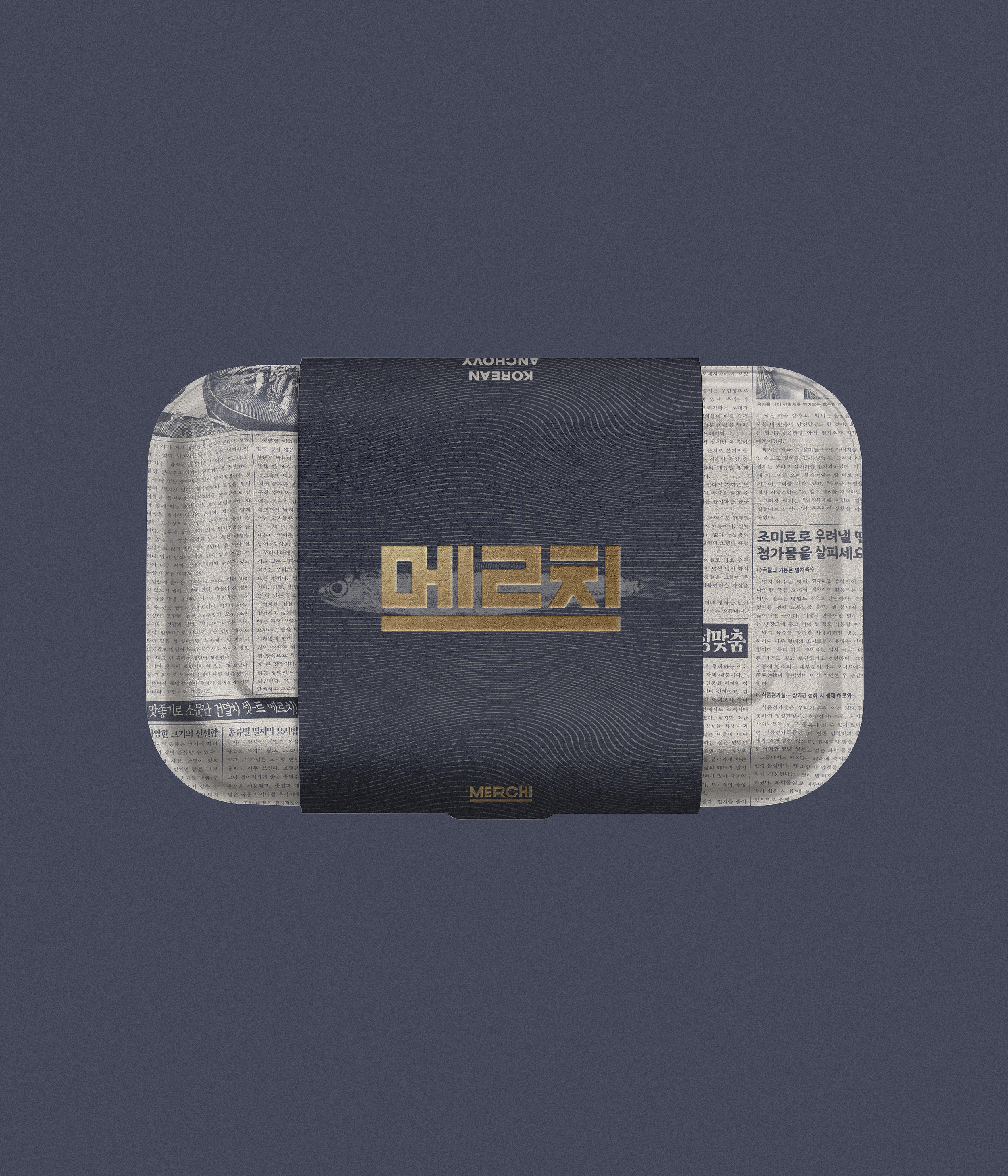
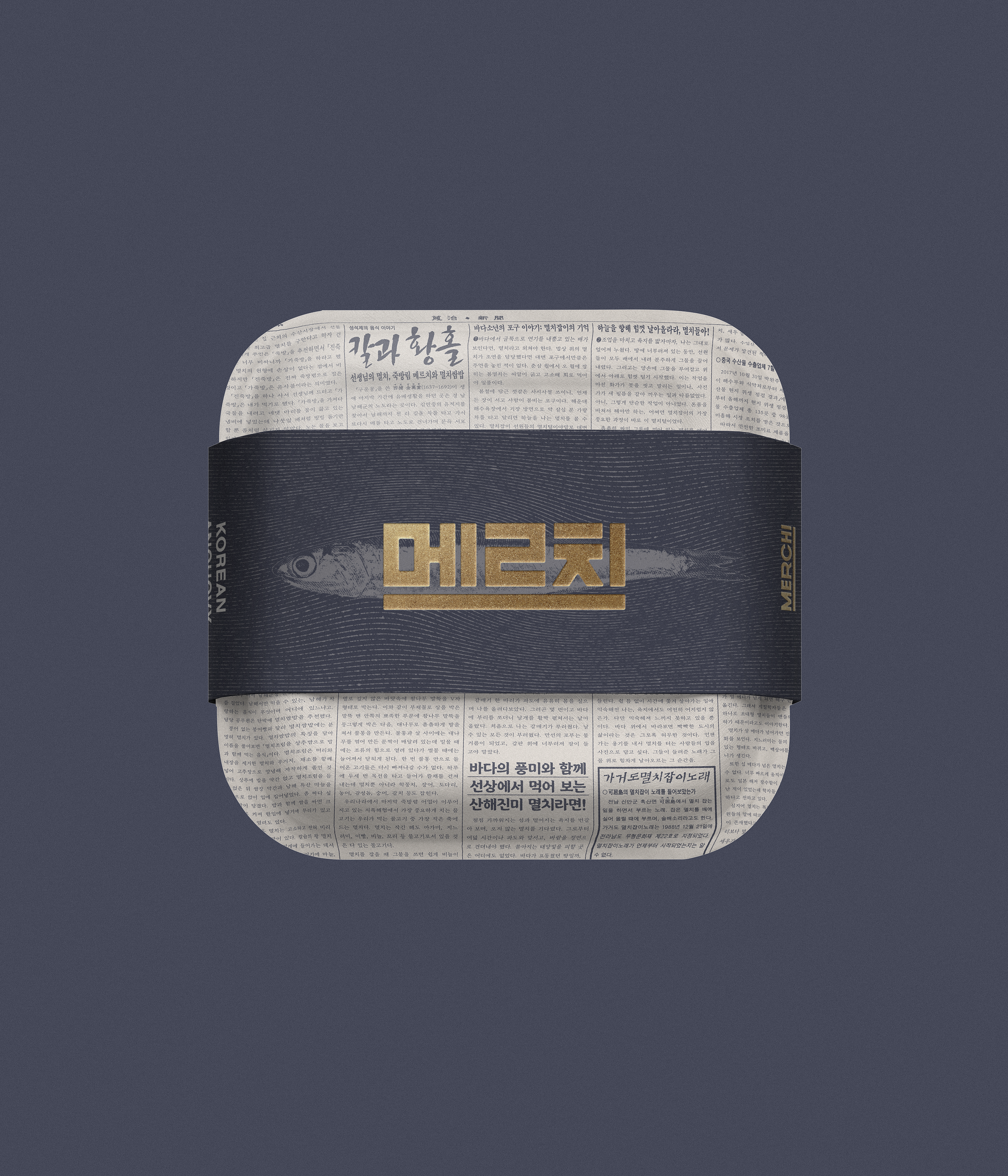
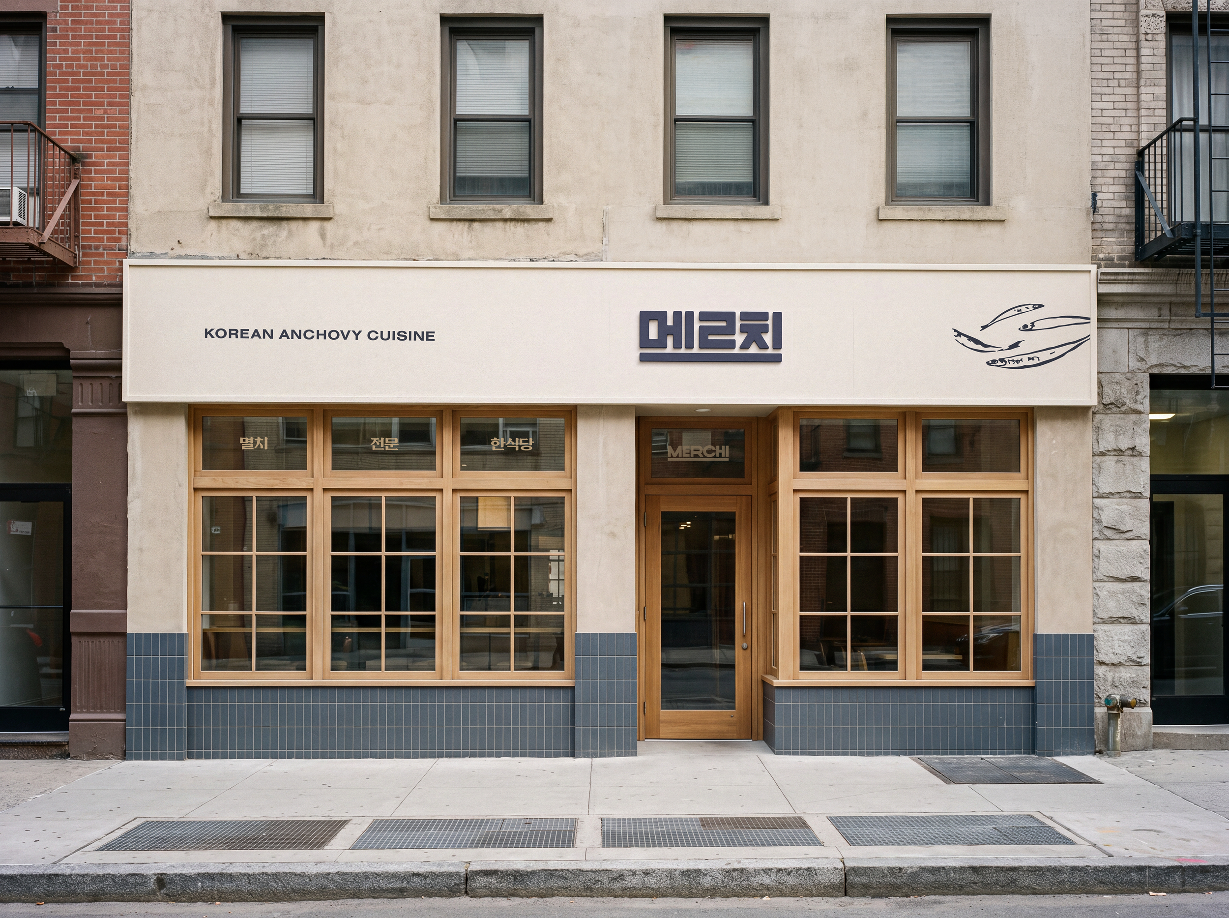
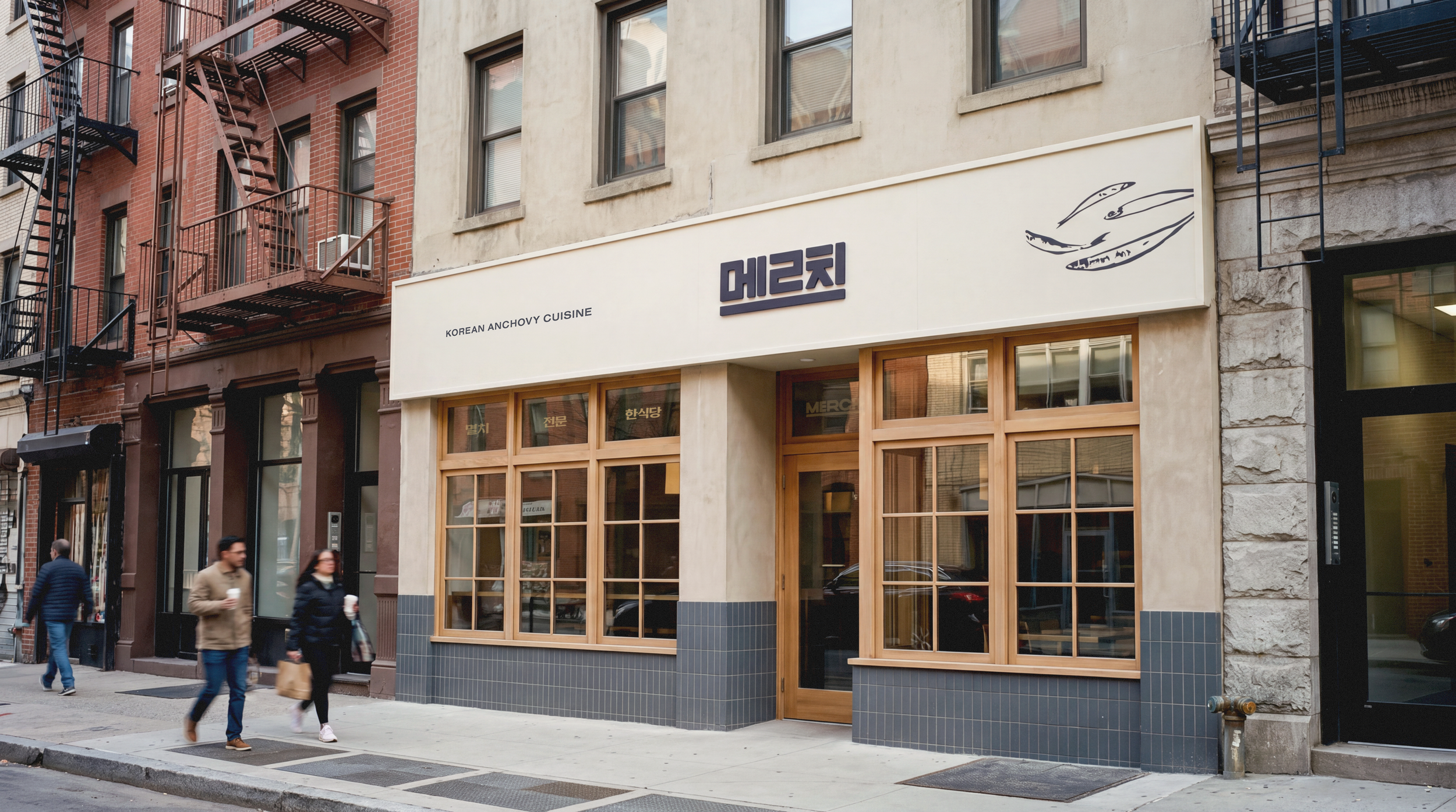
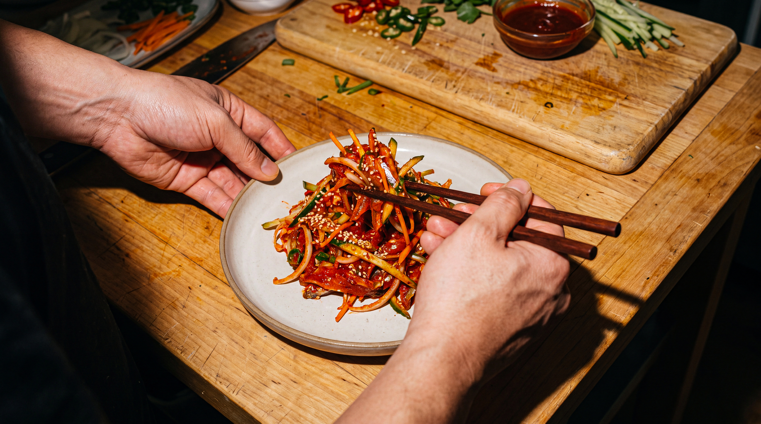
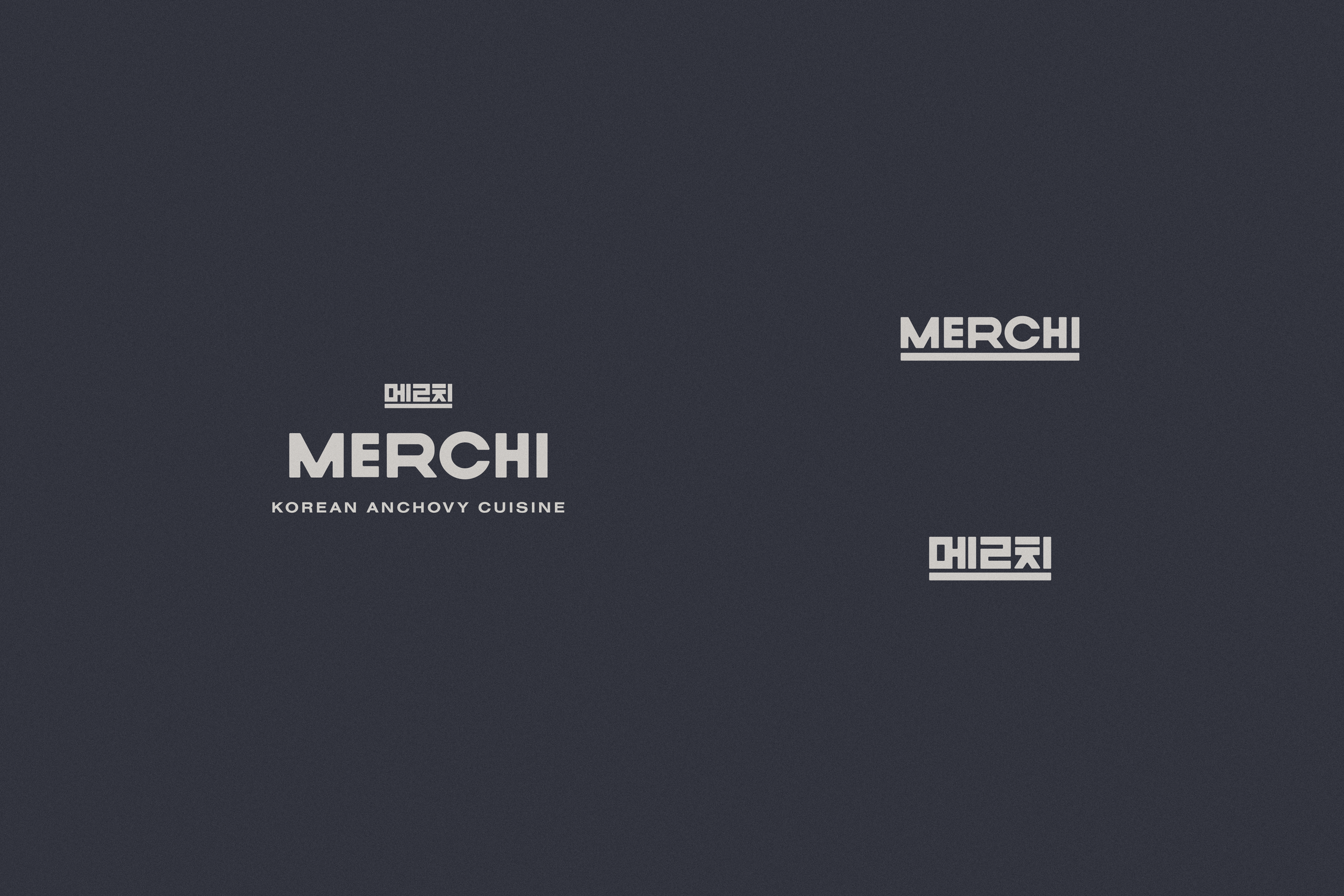
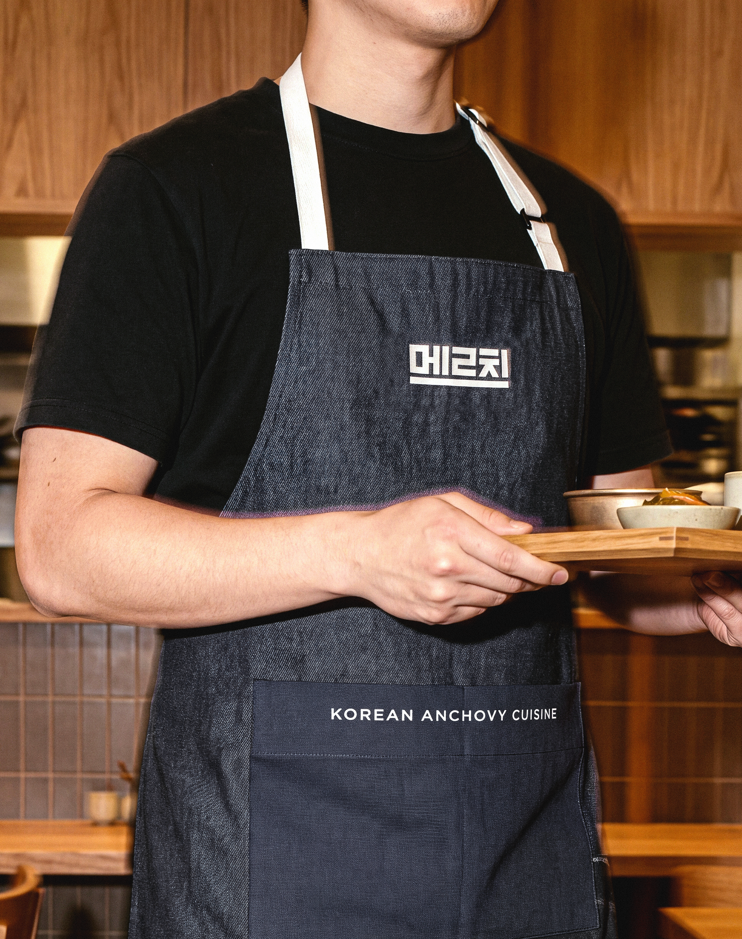
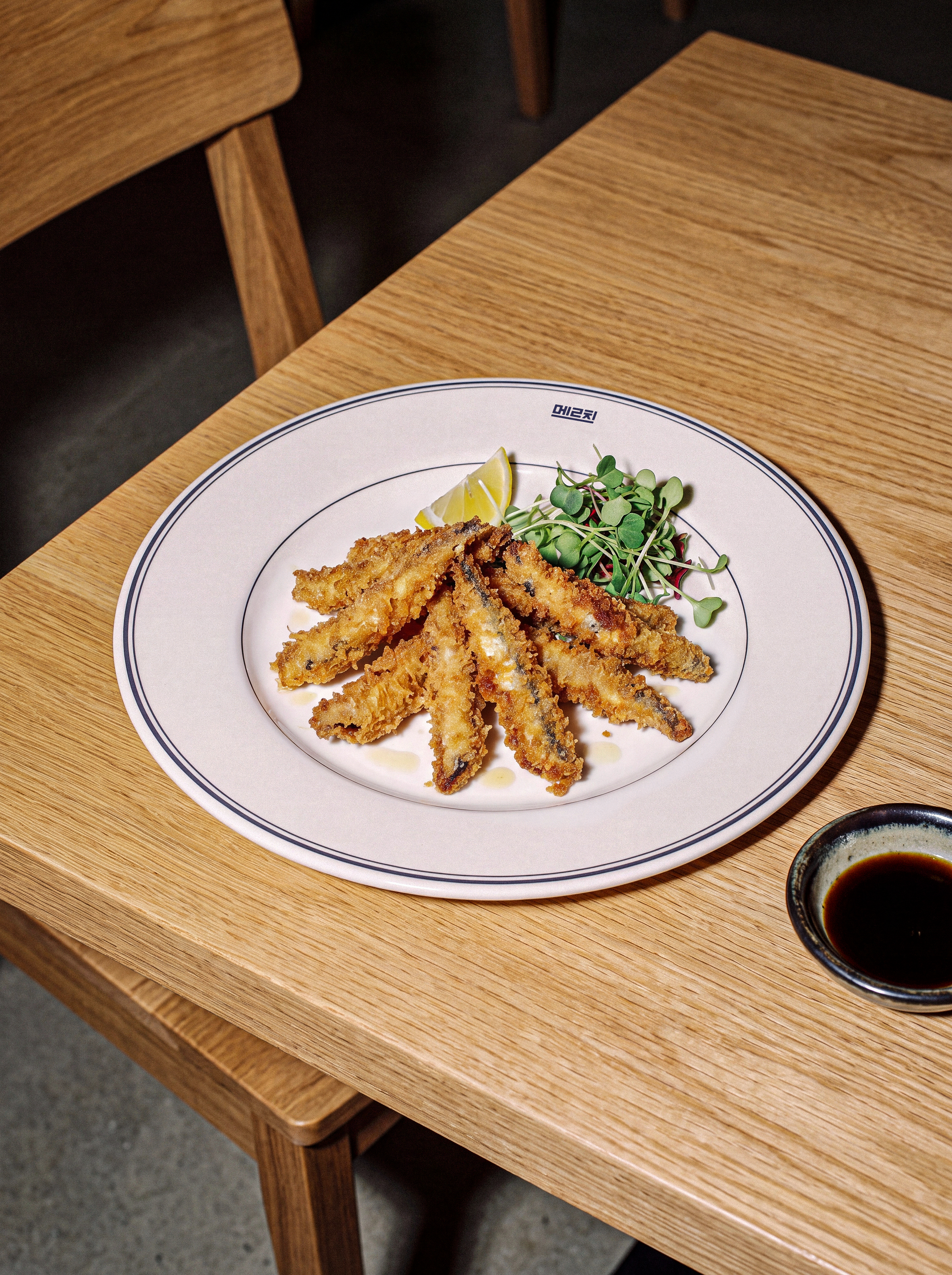
Merchi is a concept for a modern Korean restaurant in Brooklyn, New York, centered on anchovy dishes. The name comes from the Gyeongsang dialect pronunciation of myeolchi, the Korean word for anchovy. The idea began with familiar scenes from Korean everyday life. Fish sellers once wrapped fresh fish in newspaper at local markets, while families spread newspaper across the floor to prepare dried anchovies at home. These memories became the starting point for the brand.
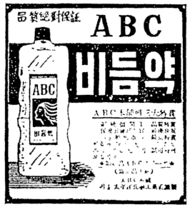
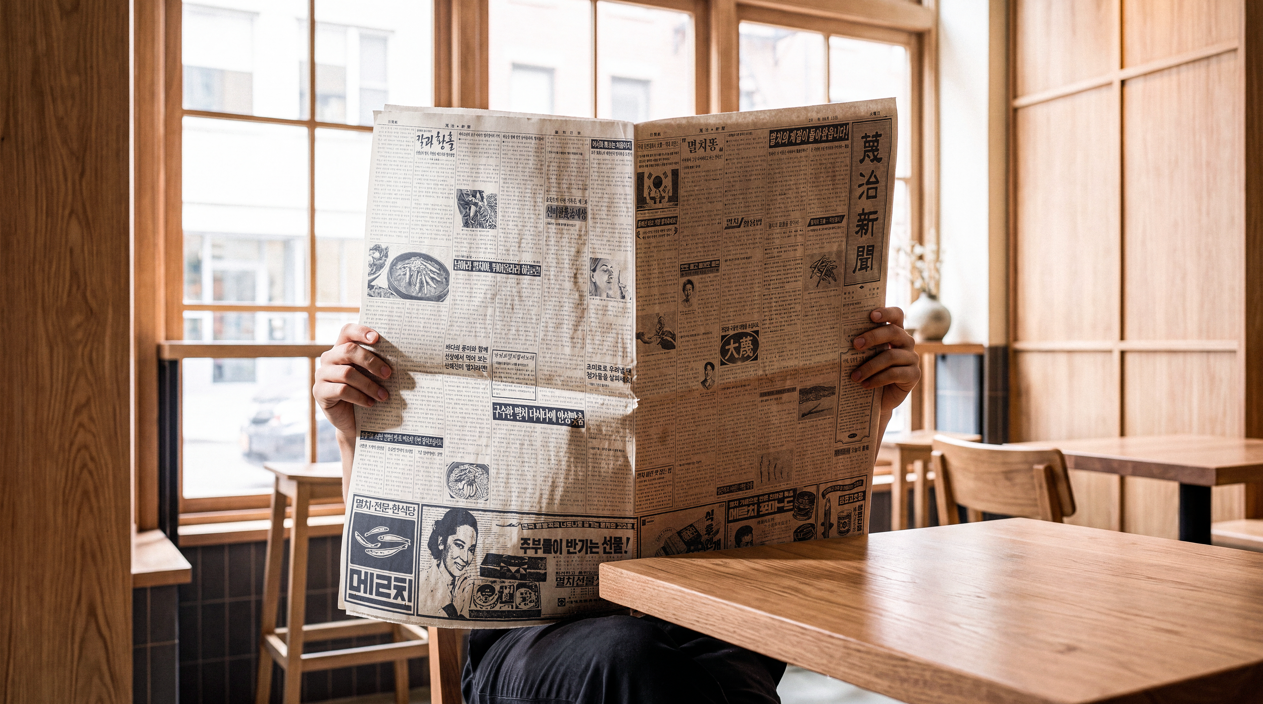
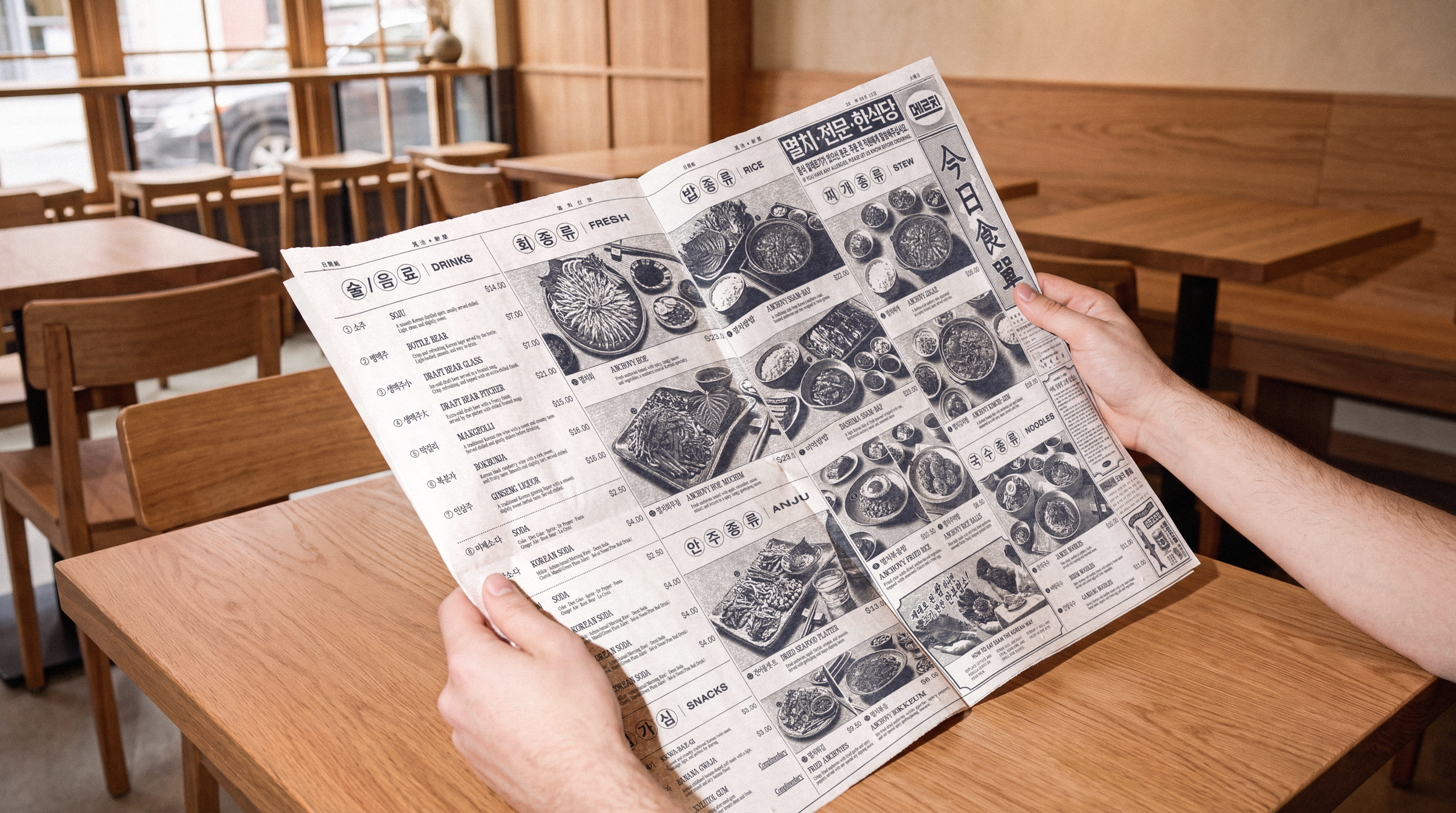
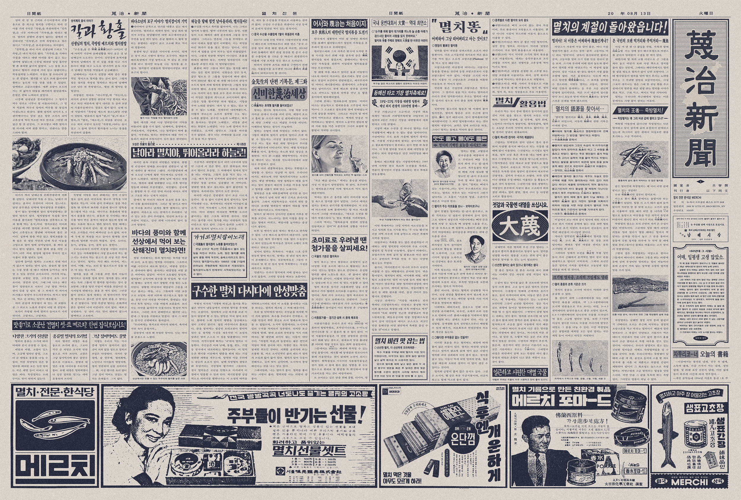
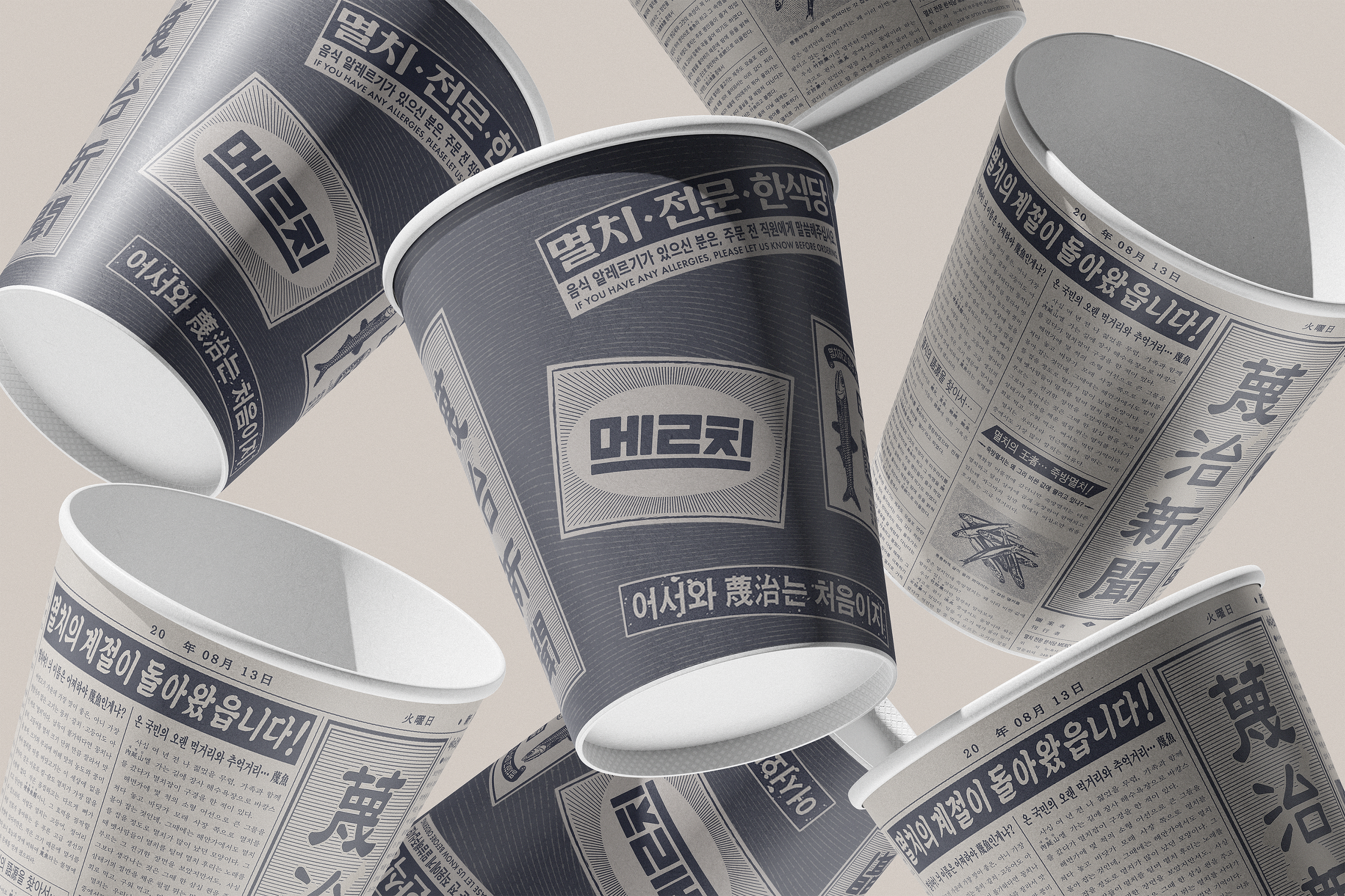
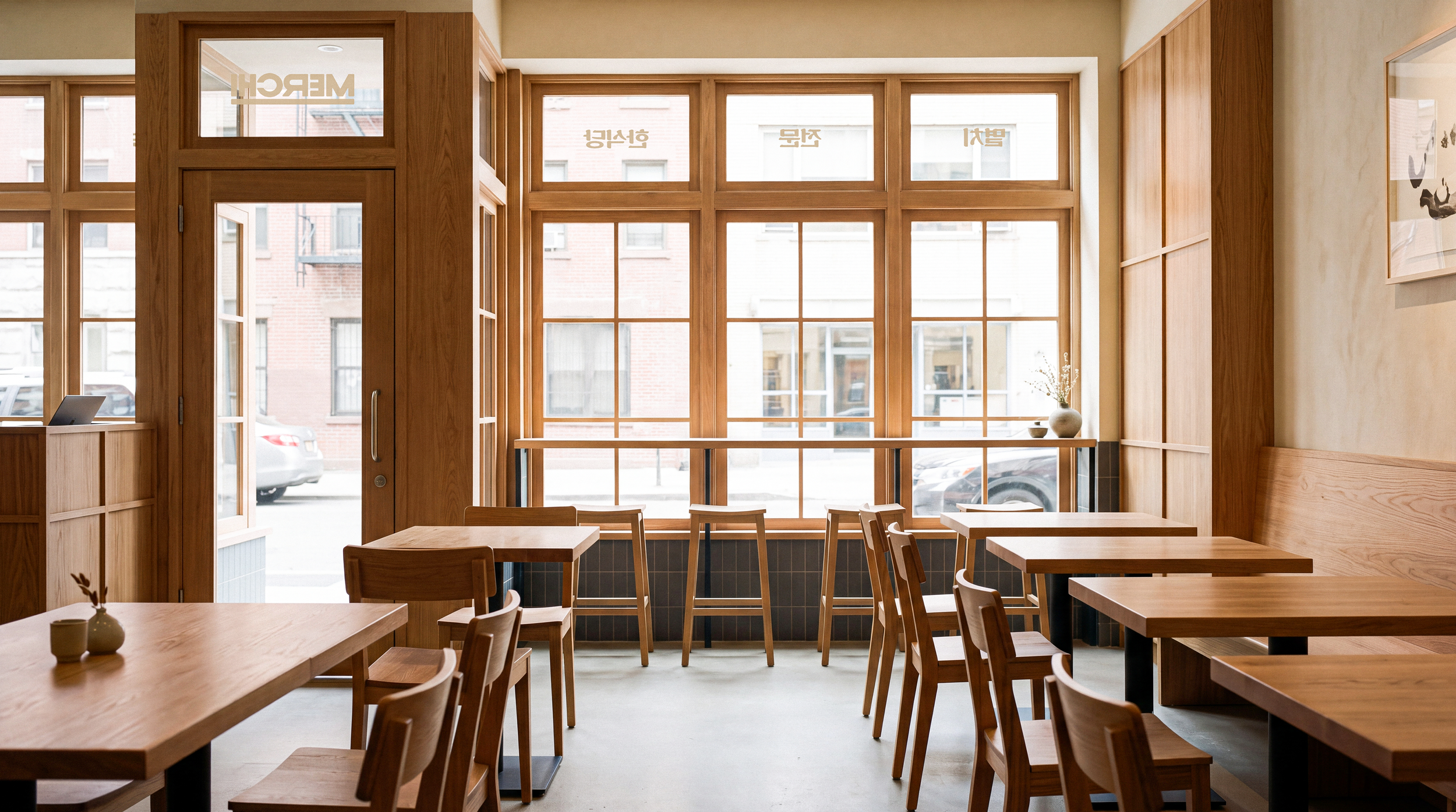
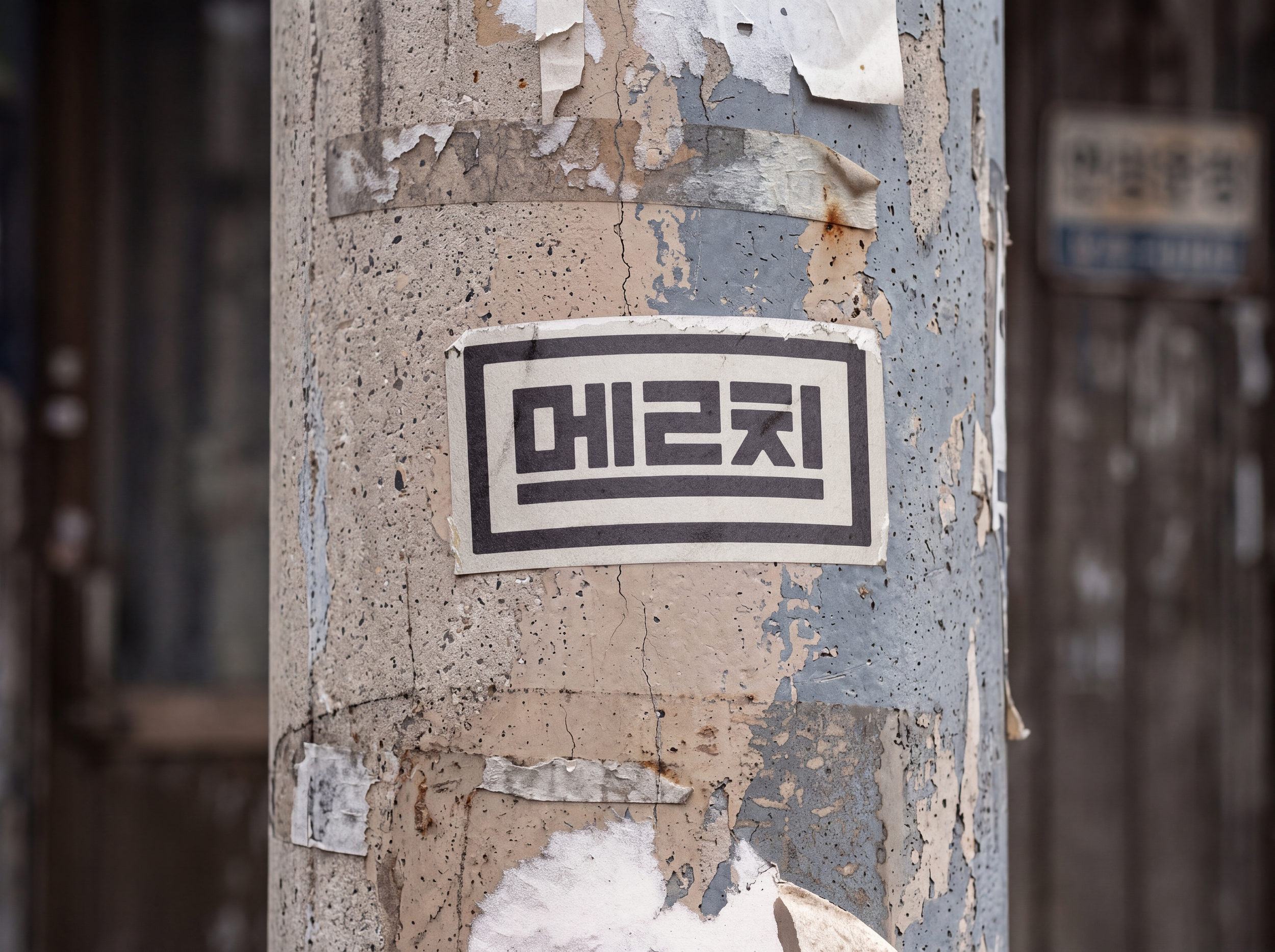
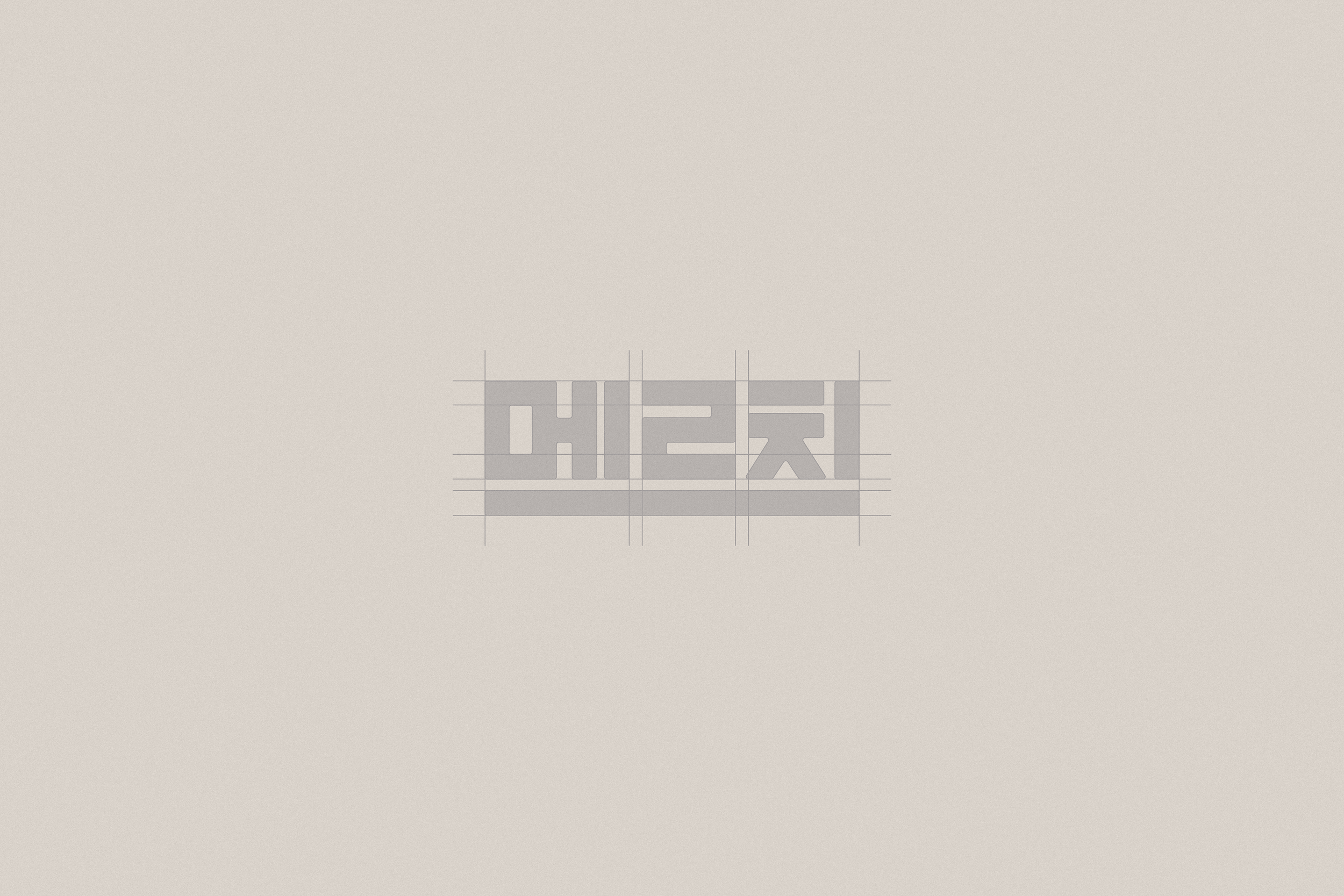
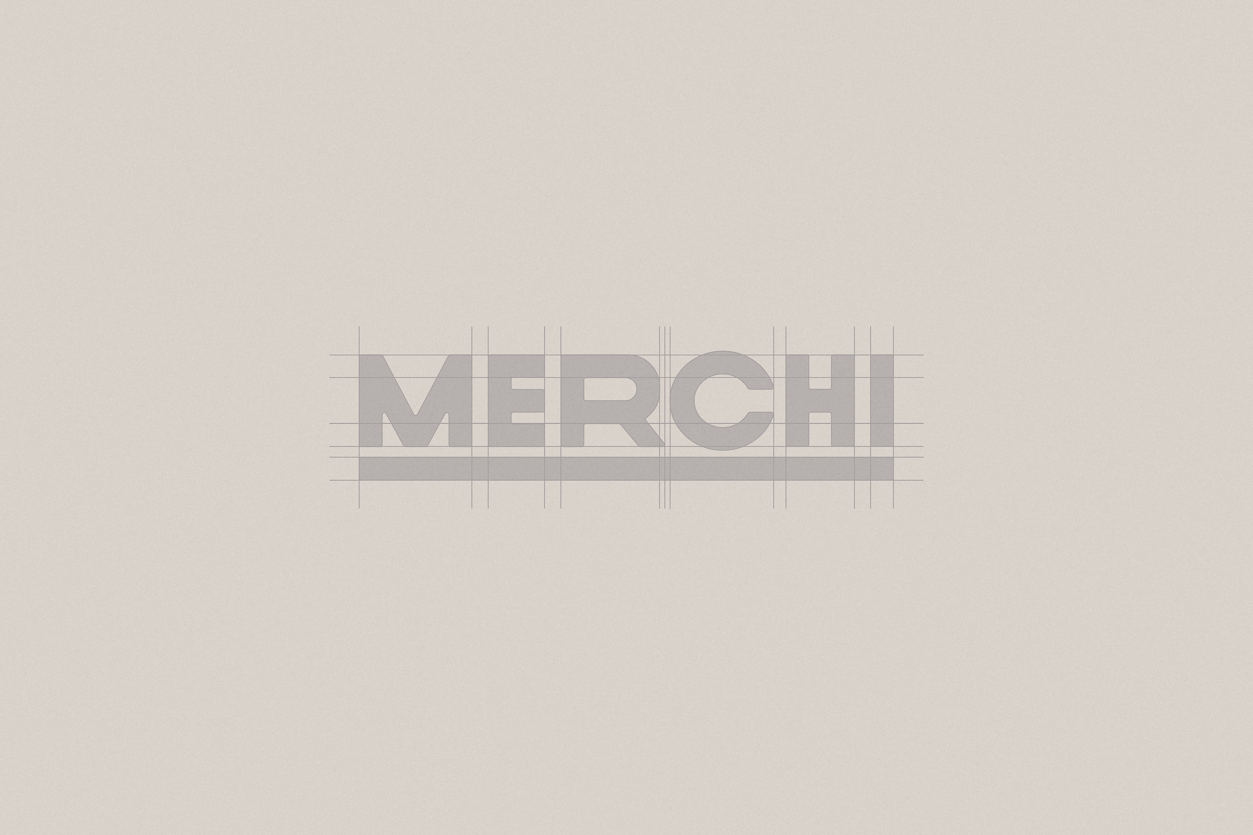
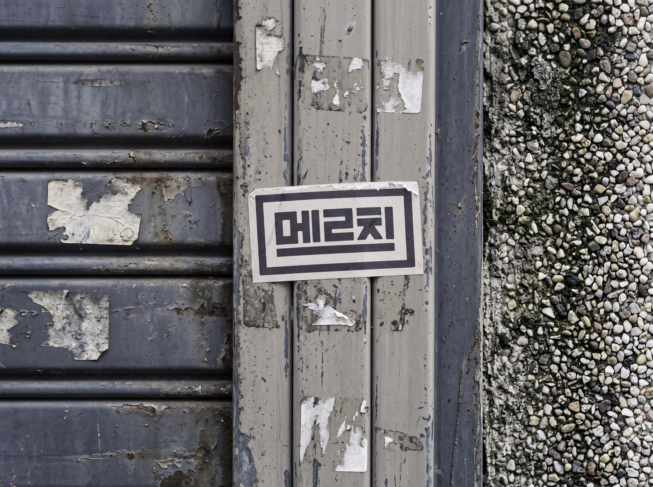
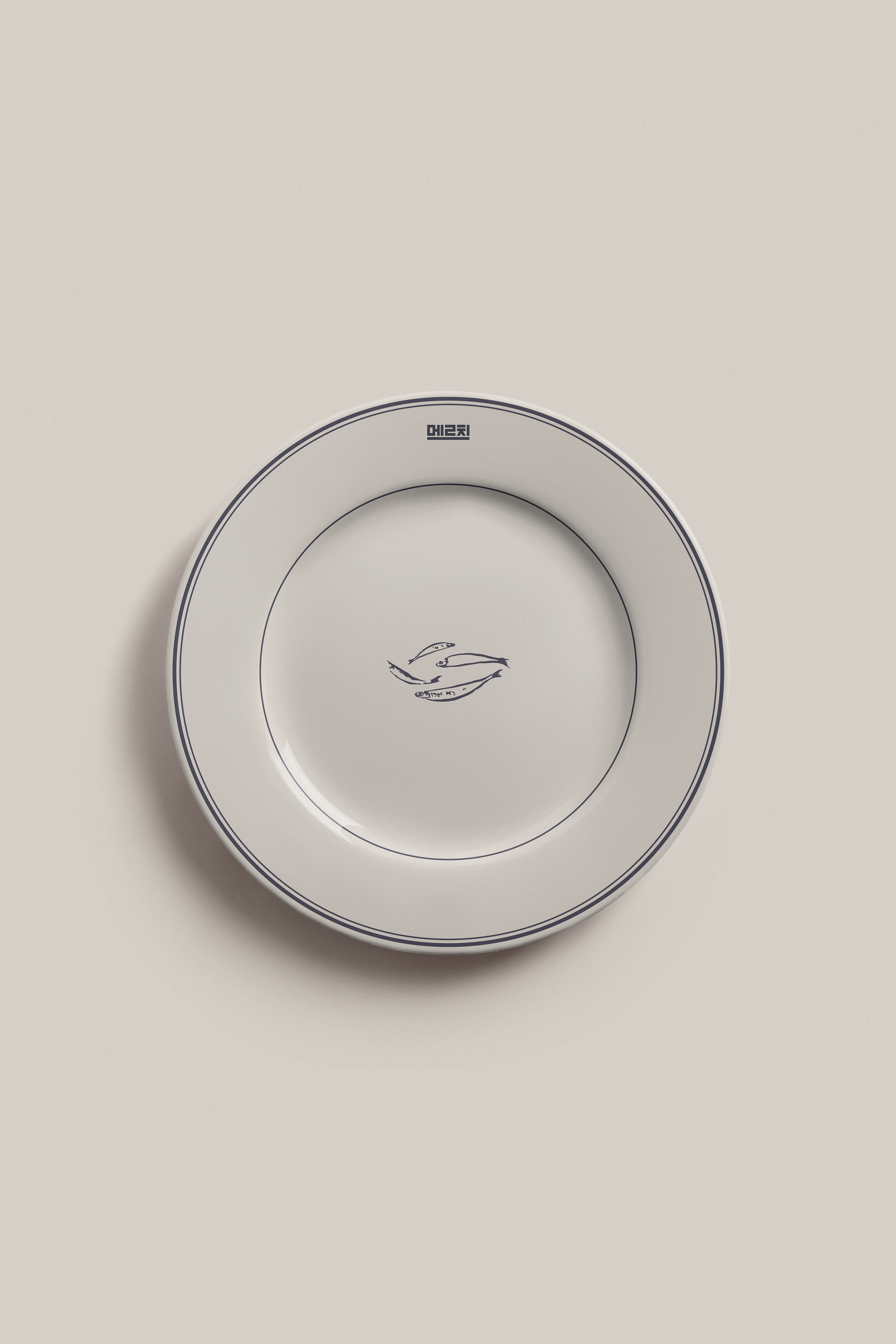
The visual identity follows a newtro concept, a modern take on Korean retro style. Old Korean newspapers, storefront signs, and advertisements inspired the layouts and Korean wordmark, with retro details simplified for a more modern look. Merchi brings an everyday Korean ingredient to the center of the dining experience, bringing back familiar memories for Koreans while introducing anchovy and its culture to new diners in a fresh and refined way.
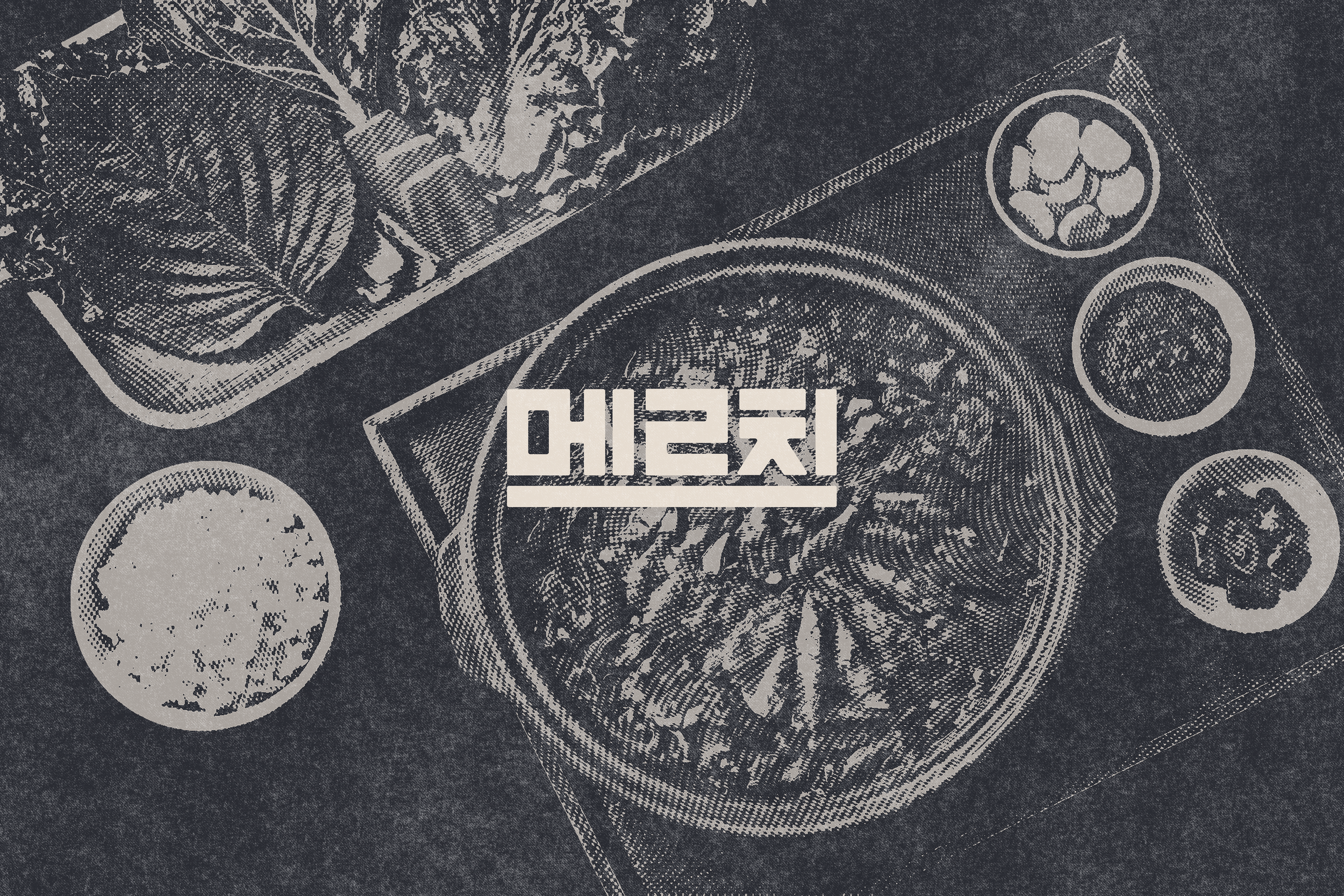



*Inspired by 1970s Korean newspaper advertising